
Color Psychology in Interior Design
Color psychology in interior design is so much more than selecting a pretty color. In fact, colors and hues have a big impact on the human brain. Professional interior designers are trained on the do's and don'ts of color combinations, and how a space can create the exact feel a client is in search of. Let’s dive deeper into this.
Black & White
Although the color white is constantly trending in interior design for a modern style, it can also feel sterile and cold. Bright white walls will enlarge a small room, but be sure to include contrasting darker accents like wall art frames and accessories. This will create dimension and a focal point.
As intimidating as it may be to paint a black accent wall, don’t rule it out. When utilized with accents such as white-framed wall art and light accessories, the contrast can create a shockingly dramatic yet elegant effect. Black accent walls are especially well received in rooms with an abundance of natural light. This color will create a sleek, modern, trendy environment and should not always be feared.
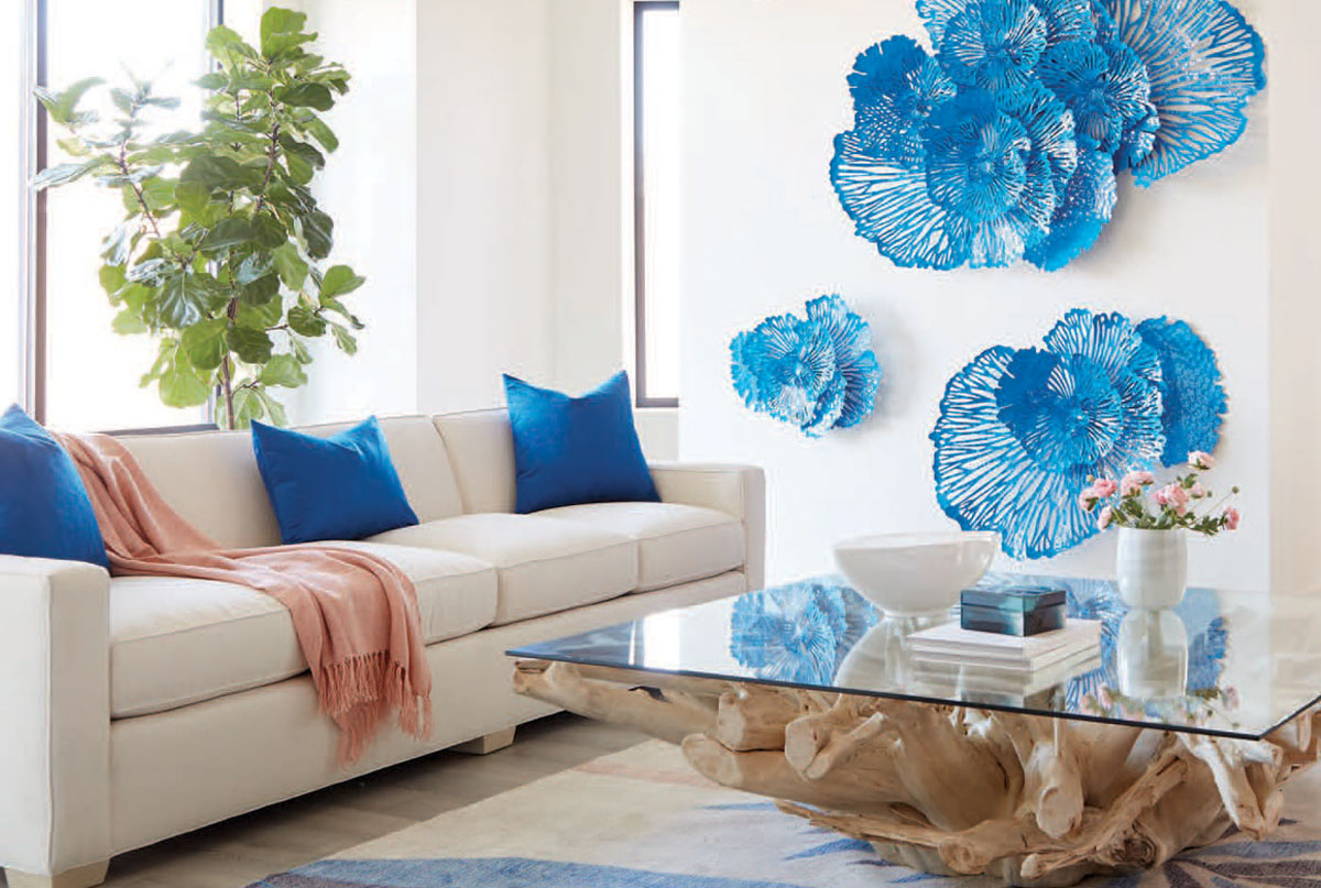
Cool Down with Blue & Green
There’s a reason blue will never go out of style, especially in coastal Florida. People romanticize the beach as a calming entity and envision their living spaces to reflect the emotion the ocean evokes. Patrick Day is filled with many shades of blue in fabrics, art, lamps, and accent furniture. Shades of aqua, navy and cobalt accent your Florida oasis and calm your mind.
Incorporating shades of green, like botanicals, in your space will instantly create a restorative and balancing feeling by bringing nature inside. Tropical patterns and vibrant greens are making a comeback in a big way!
Warm Up with Red & Orange
Home gym, office area, eateries, and creative spaces—these are the locations you’ll want to utilize red and orange hues. Red has the ability to trigger energy and entice feelings of passion and excitement. It's one of the most powerful colors as it immediately awakens the mind.
Orange also packs a punch, creating an energizing, citrusy vibe wherever it lives. While peaches and coral hues may feel much calmer, it would be best to avoid reds and oranges in a quiet reading nook or relaxing bathroom where a search for calm is the sole purpose.
CoLOR SETS THE MOOD
When creating a space, it’s important to select hues that speak to you, but remember the importance of color psychology in interior design and the feeling you wish to express before opening the paint can and purchasing the accessories! Stop by our store and get inspired by our numerous vignettes in many color culminations that will suit your design style.