We understand the appeal of neutrals. They're refined, they're versatile, and they rarely feel like a risk. But somewhere along the way, neutrals became the default rather than the choice. And when every surface in a home reads beige, white, or gray, the space can start to feel more safe than sophisticated.
This February, we're making the case for color. Not as decoration, but as design.
The quality of light here is extraordinary. It pours through windows, reflects off water, and shifts throughout the day in ways that northern climates simply don't experience. That light does something important to color. It softens intensity, reveals nuance, and allows deeper tones to breathe.
What might feel heavy or overpowering elsewhere becomes richly layered here. The natural world outside isn't neutral. The water shifts between azure and teal. The sky deepens at dusk. The landscape offers verdant greens year-round. Color isn't foreign to this place. It belongs here.
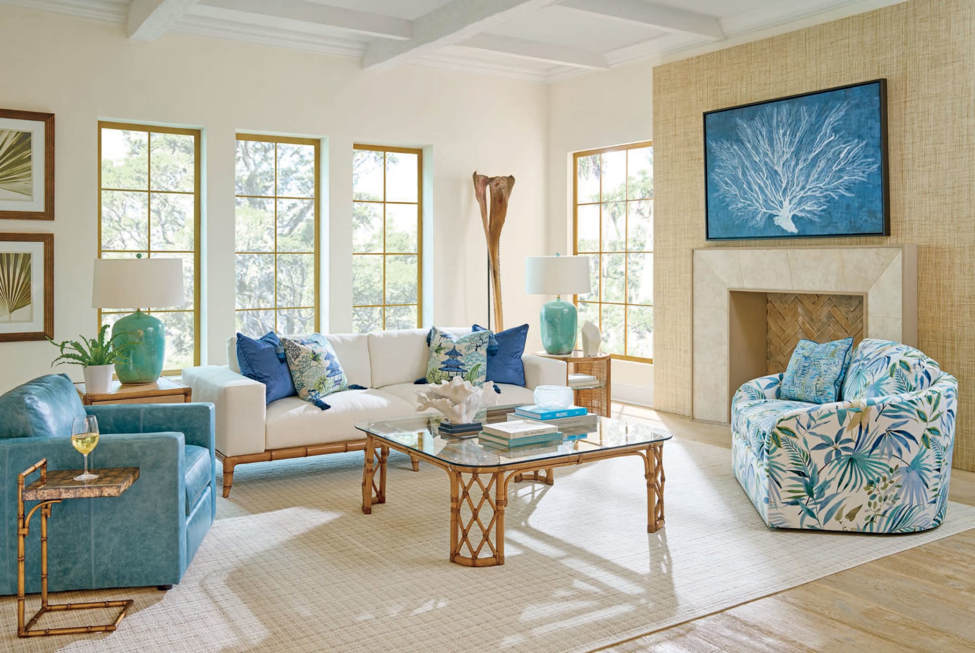
When clients want to move beyond neutrals but aren't sure where to begin, we often suggest blues and greens. Not because they're trendy, but because they work. Aqua, teal, seafoam, deeper turquoise—these tones feel both calming and intentional.
The key is in the pairing. A teal sofa gains sophistication when styled with natural linen, warm wood, and textured accessories. An aqua chair becomes a statement when placed against neutral walls with thoughtful lighting. These colors don't need to dominate. They need to be deliberate.
We've found that blues and greens integrate seamlessly with the materials our clients already love—rattan, stone, organic textiles, polished metals. The contrast keeps things interesting without feeling forced. You achieve presence without sacrificing balance.
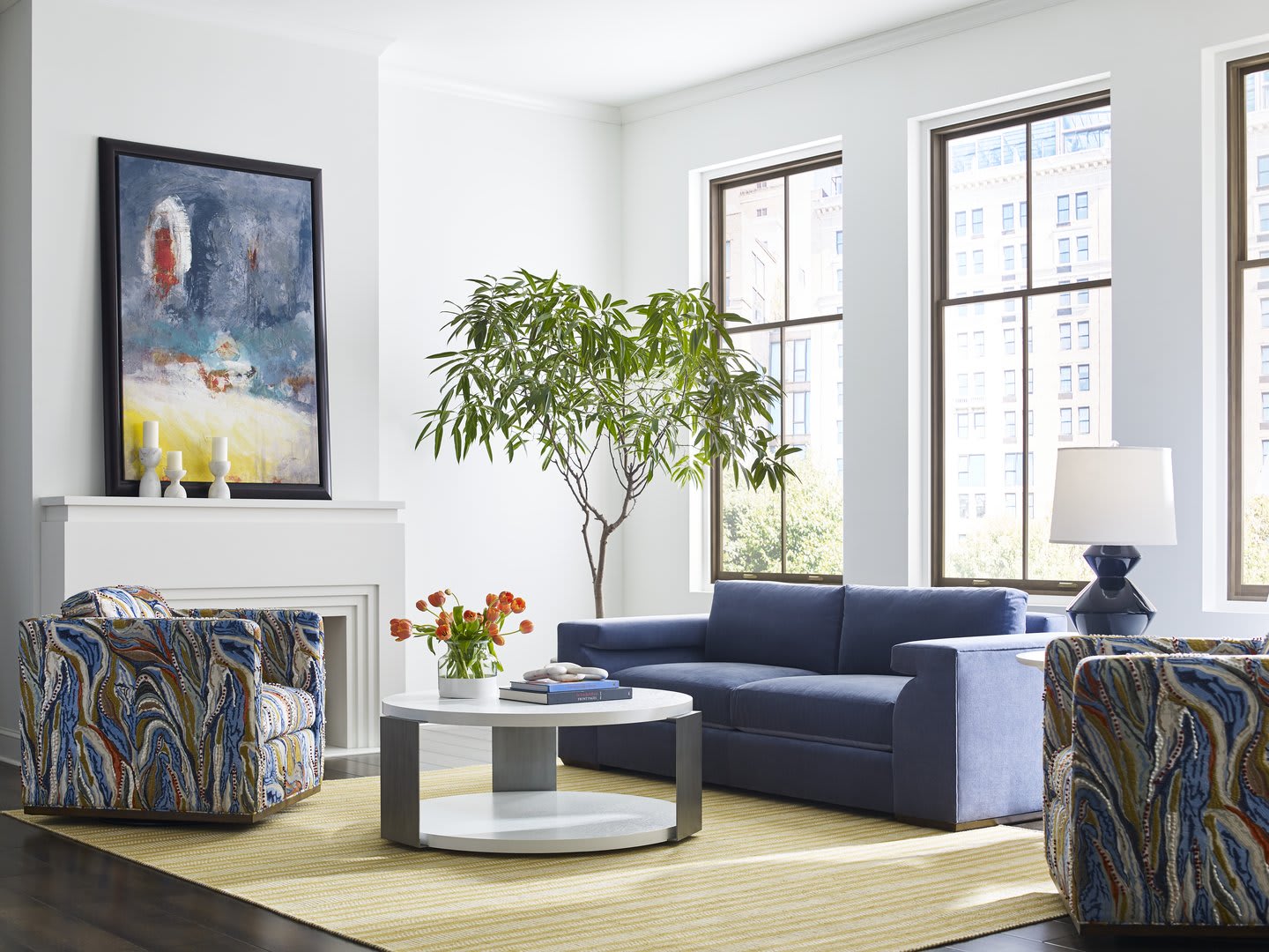
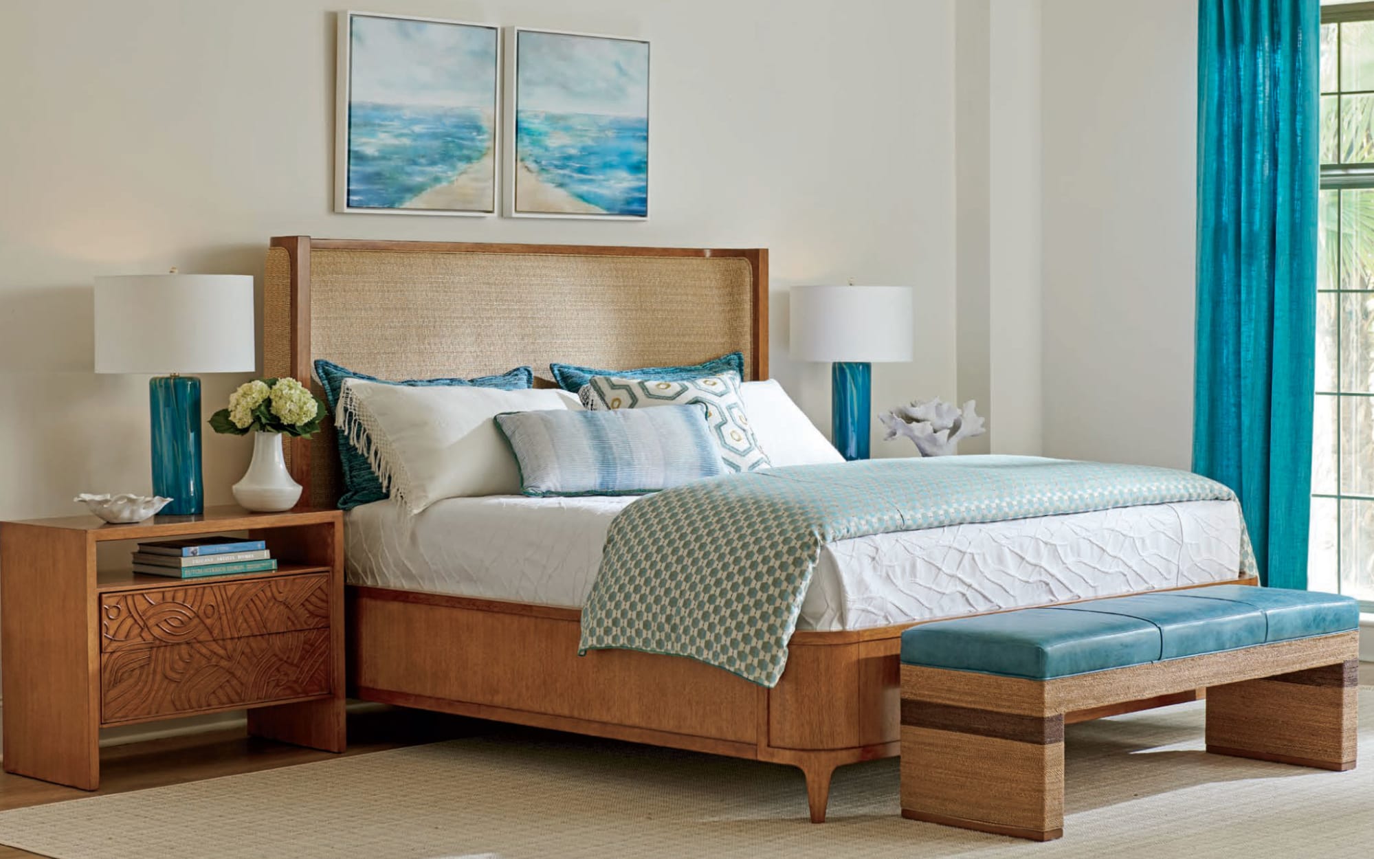
If introducing a single bold color feels like too much of a leap, consider layering within the same family. A soft sky blue with navy. Seafoam paired with deeper emerald or teal. This approach adds dimension without complication.
Clients have told us that a deep navy sofa anchored their living room in ways a neutral piece never could. Lighter aquas work beautifully in more intimate spaces—bedrooms, reading nooks—because they bring calm without fading into the background. When you introduce patterned upholstery or pillows that pull multiple tones together, the room begins to feel curated rather than assembled.
If the idea of a colored sofa feels like too much right away, start with supporting pieces. A patterned chair that pulls in both your neutrals and a richer tone. Pillows that introduce color without permanent commitment. A rug that anchors the space with depth.
We've watched rooms shift entirely because someone finally brought in the right piece. Sometimes it's a single chair in teal velvet. Sometimes it's swapping out neutral throw pillows for ones with pattern and presence. The transformation isn't about overhauling everything at once. It's about layering intentionally until the room starts to feel like it has a point of view.
Color creates focus. It establishes mood. It reflects the person living in the space rather than just filling it. Neutrals will always have their place, and we design plenty of beautiful neutral interiors. But when someone is ready to move beyond safe, color becomes the tool that makes a home feel distinctly theirs.
This isn't about following what's popular or making a bold statement for its own sake. It's about understanding that a well-chosen palette—one that considers light, materials, and how you actually live—elevates everything else in the room.
Visit the Patrick Day Home Gallery showroom to explore how color can bring depth and character to your space. See how layered blues work with natural materials, how a single piece in the right tone can anchor a room, and how thoughtful color choices create spaces that feel both refined and personal. Our team is here to help you move beyond neutrals with confidence, creating a home that feels considered, intentional, and unmistakably yours.
