
Gallery Walls That ACTUALLY Work
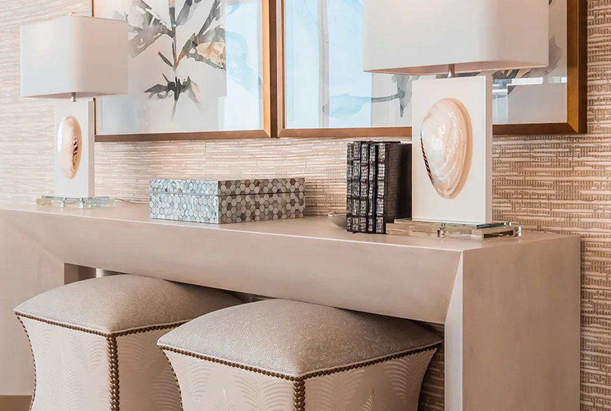
Most gallery walls fail because people wing it. You end up with crooked frames, weird spacing, and art that fights with your furniture instead of complementing it.
the it's about the big picture
We always start with one main piece. Could be your biggest artwork or just your favorite. Everything else gets arranged around that. No anchor piece means no focus, and no focus means your wall looks like a garage sale.
The other pieces don't have to match exactly, but they need something in common. Same color family, similar frames, or a shared style. Without some connection, it's just random stuff on a wall.
Getting the Measurements Right
Spacing between frames makes or breaks the whole look. Too close and they crowd each other. Too far and they float around looking lost.
Height is where most people mess up when they try to do it themselves. Plus hanging everything straight and level while getting the spacing right - it's trickier than it looks.
Colors That Connect
Your gallery wall needs to talk to the room somehow. Maybe it picks up the blue from your sofa pillows or echoes the wood tone in your dining table. Doesn't have to be obvious, just connected.
Black and white photos are foolproof. Add color carefully - two or three main colors max, plus some neutrals. More gets chaotic fast.
Where They Work Best
**Behind the sofa**: This is gallery wall central. Big impact spot, so make it count. Mix in a small mirror or sculptural piece if you want texture.
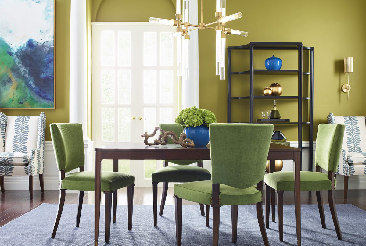
**Dining rooms**: More formal spaces can handle symmetrical layouts. Matching frames, even spacing. Gives dinner guests something nice to look at.
**Bedrooms**: Keep it calm. Restful colors, peaceful subjects. Nothing too stimulating where you're trying to sleep.
**Hallways**: Long walls need horizontal arrangements. A row of similar pieces works better than one big cluster.
Frame Choices Matter
Consistency beats expensive. All black frames look better than a mix of fancy and cheap ones. The art should grab attention, not the frames.
White mats make everything look more expensive. They give your eye a place to rest and make cheap prints look professional.
What Goes Wrong
Hanging everything too high kills the whole thing. Your gallery wall should feel connected to the room, not floating near the ceiling.
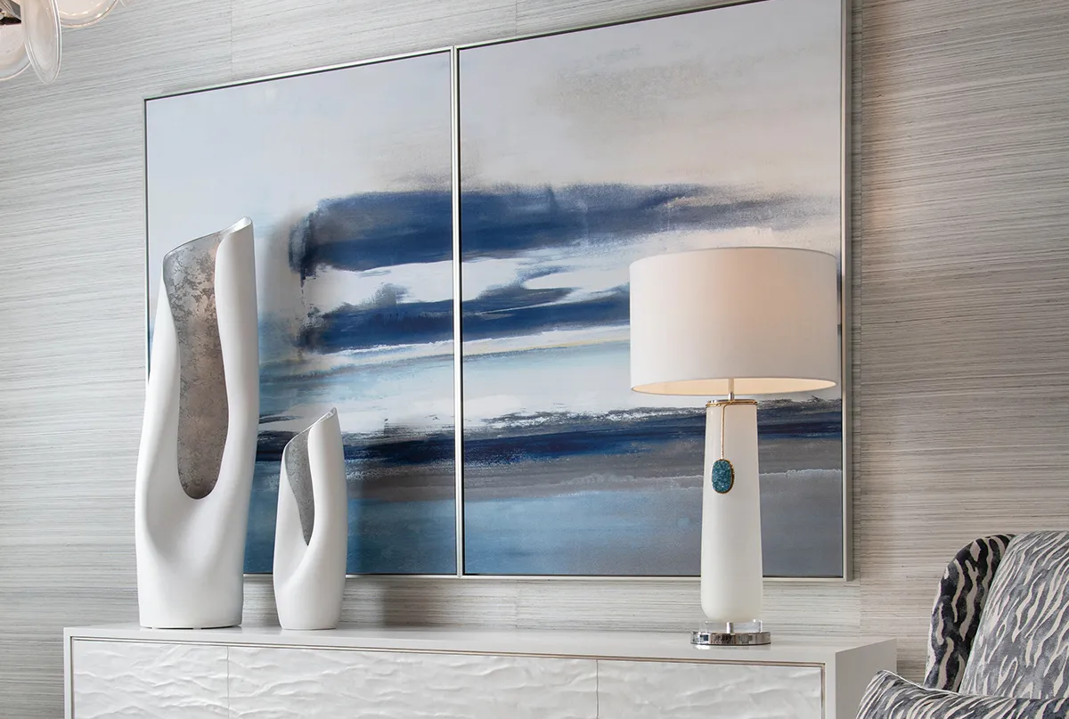
Going too small is another mistake. A tiny arrangement above a big sofa looks like an afterthought. When in doubt, go bigger.
Bad lighting wastes good art. A picture light or nearby lamp makes everything look better, especially at night.
Why We Handle It
Gallery walls look simple but they're not. Getting the spacing right, choosing frames that work together, hanging everything straight and secure - it takes experience. Plus we know how to make the wall work with your existing furniture.
We've done hundreds of these. Come see some examples at our Jupiter showroom and we'll talk about what would work in your space.